Visual Communication - Bachelors

PhoJoy Branding Project

PhoJoy redefines instant pho, fusing tradition and modernity in its chicken and beef flavors. Packaging blends authentic imagery with bold colors and innovative design, offering a portal to Vietnamese culture, culinary art, and the seamless union of old and new, delivering an immersive experience in convenient form.

PHOJOY

LOGO

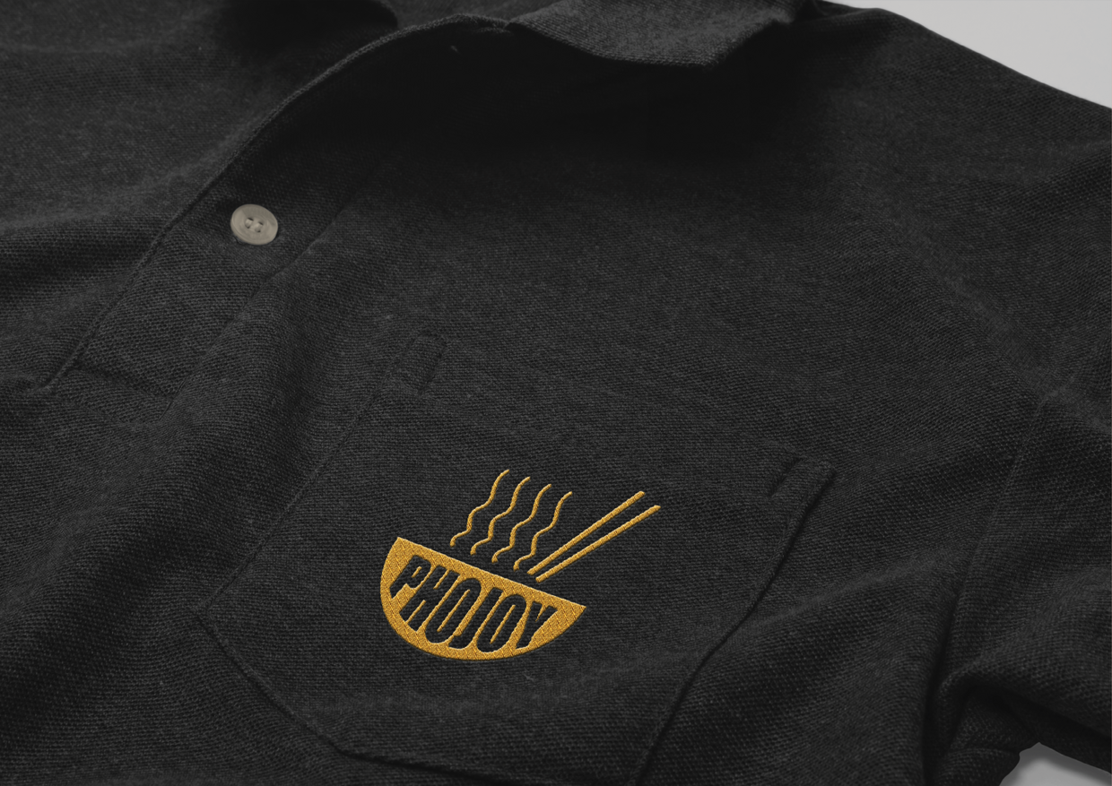
As the name for an instant pho brand, “PhoJoy” suggests a playful and appetizing take on the traditional Vietnamese dish, pho. The word “Pho” itself refers to a popular Vietnamese noodle soup known for its rich flavors and aromatic broth, and “joy” adds an element of delight and enjoyment. This brand name implies a convenient and enjoyable way to experience the flavors of pho, capturing the essence of savoring this beloved cuisine with ease and pleasure. It conveys a sense of comfort, warmth, and satisfaction that one might associate with a comforting bowl of pho, even in an instant form.

LOGO VARIATIONS

SUPPLEMENTARY IMAGES

PACKAGING DESIGN

PACKAGING MOCKUPS

OTHER PRODUCT MOCKUPS

INTRODUCTION VIDEO

Thu Van Tran

As a full-time student majoring in Visual Communication at QUT since 2021, Katy has always nurtured a profound passion for art and design. She possesses a skill set that includes Adobe Illustrator, Photoshop, and InDesign, and she's actively honing her abilities in Blender and Maya. As a sophomore, Katy is keen to explore internship opportunities within her design major and harbors a future interest in food photography. Apart from her artistic pursuits, she also enjoys part-time work as a barista and is a coffee enthusiast.